 Image 1 of 3
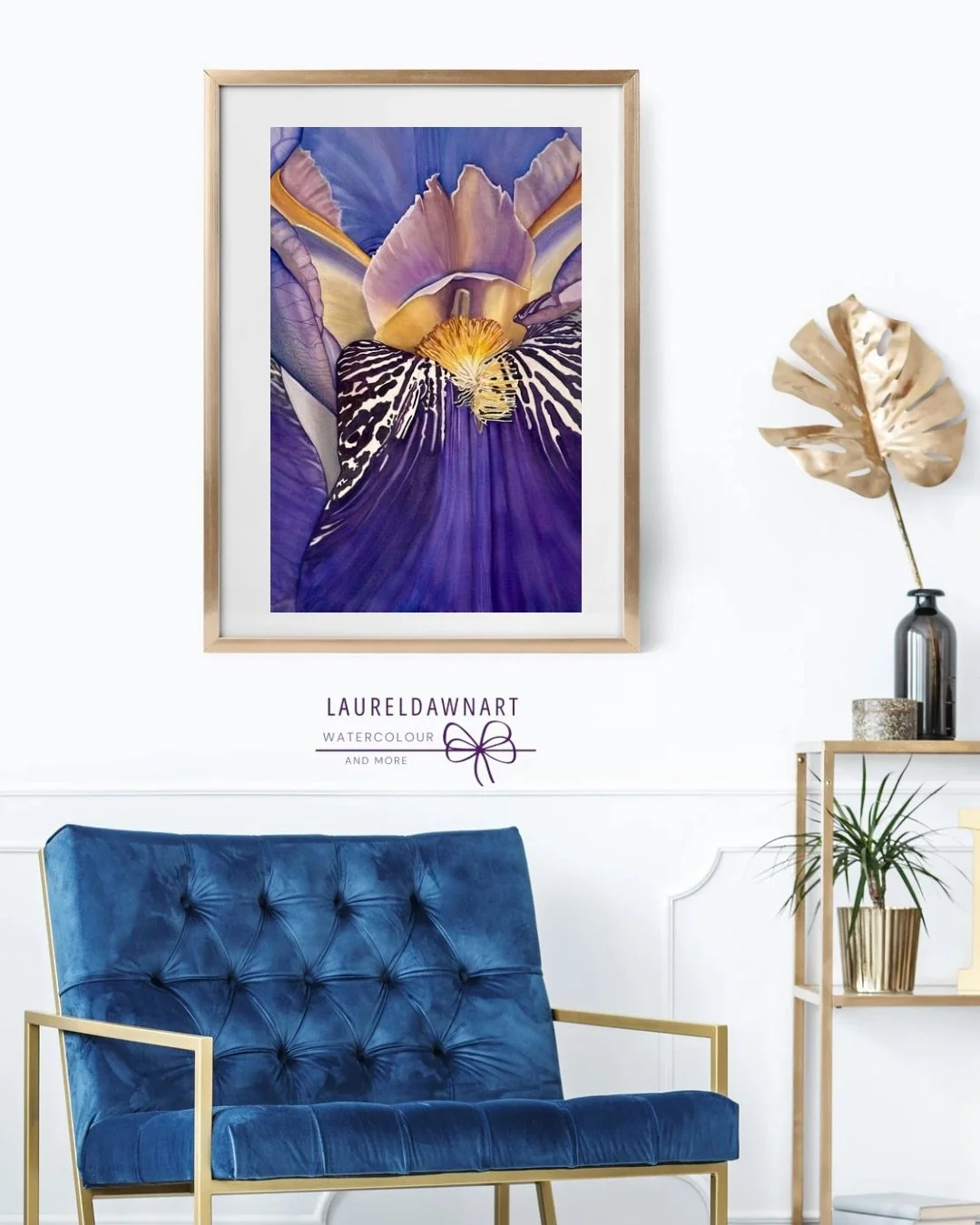 Image 2 of 3
 Image 3 of 3
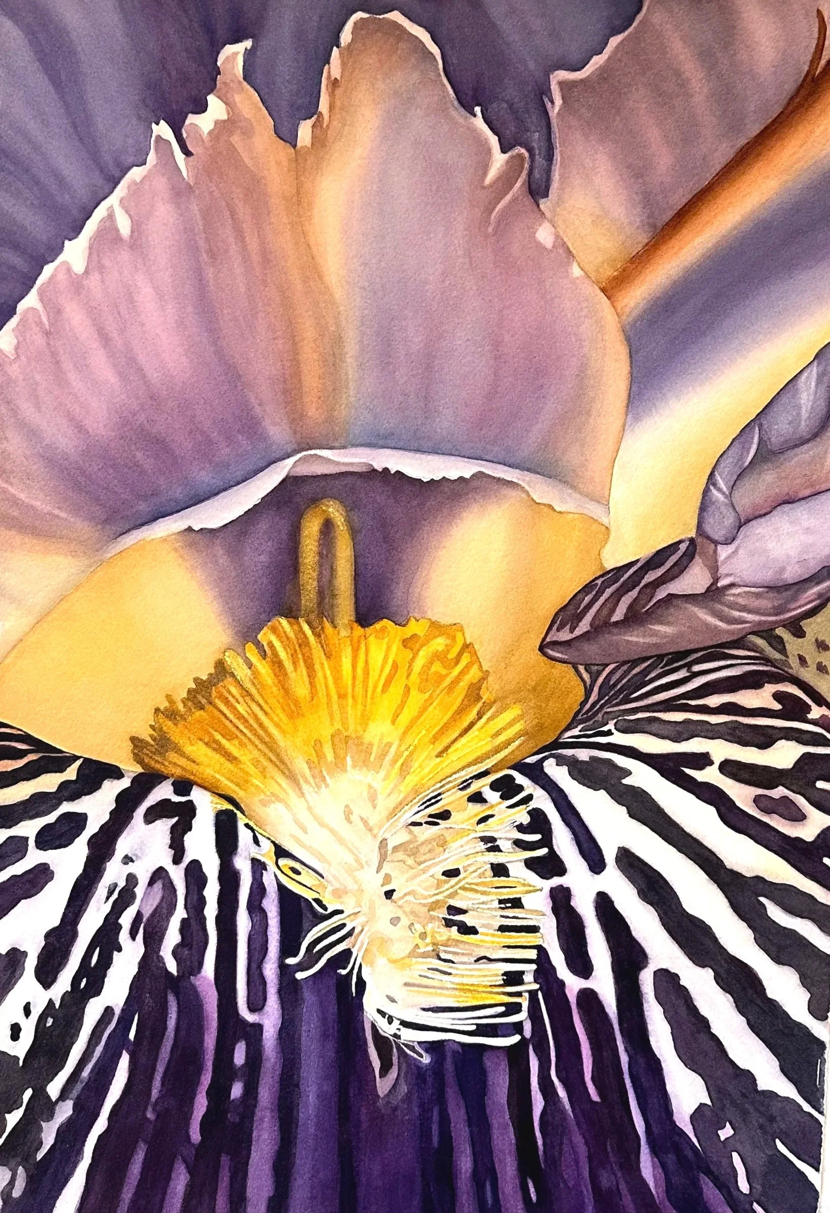
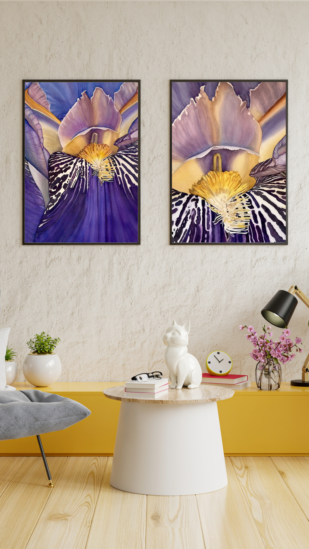
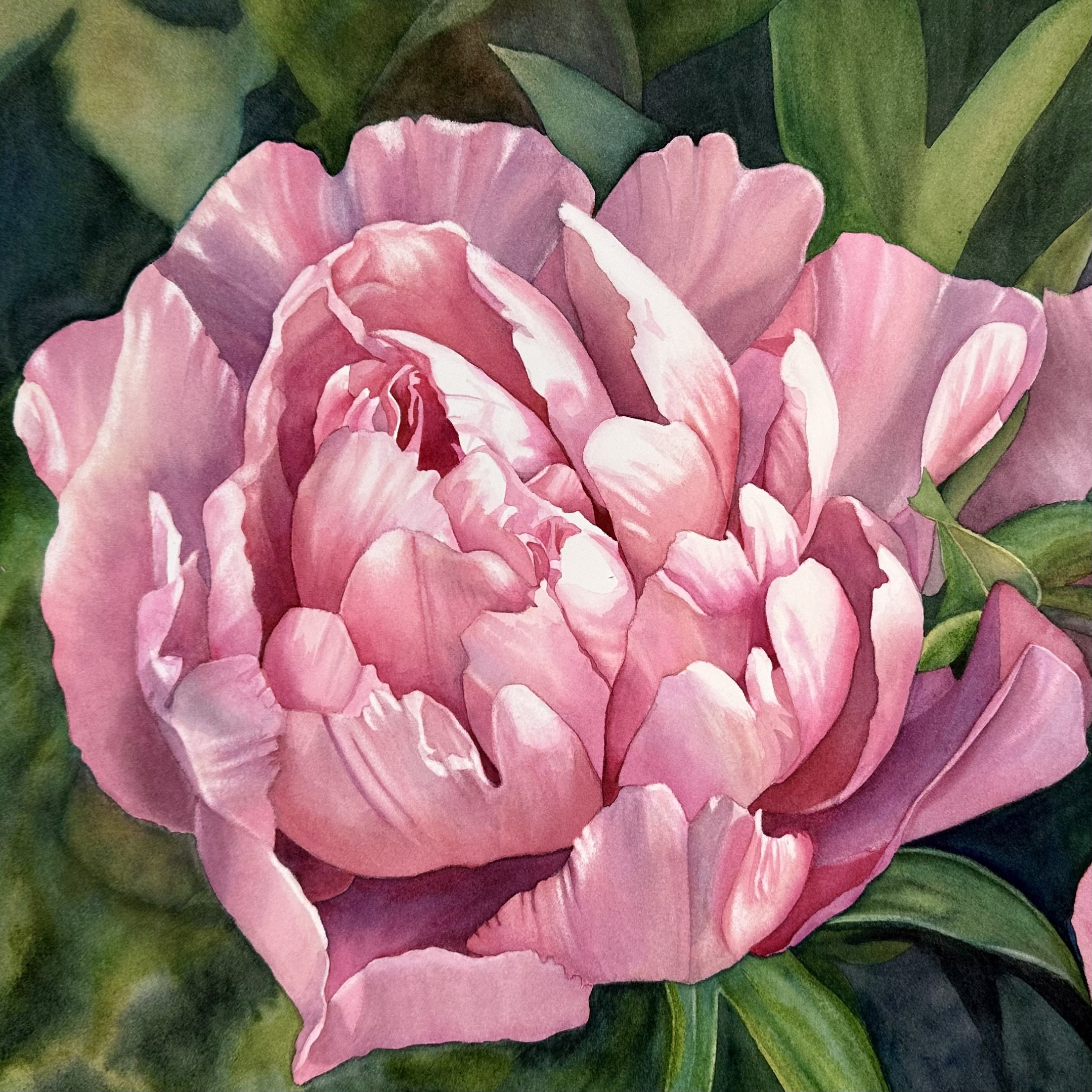
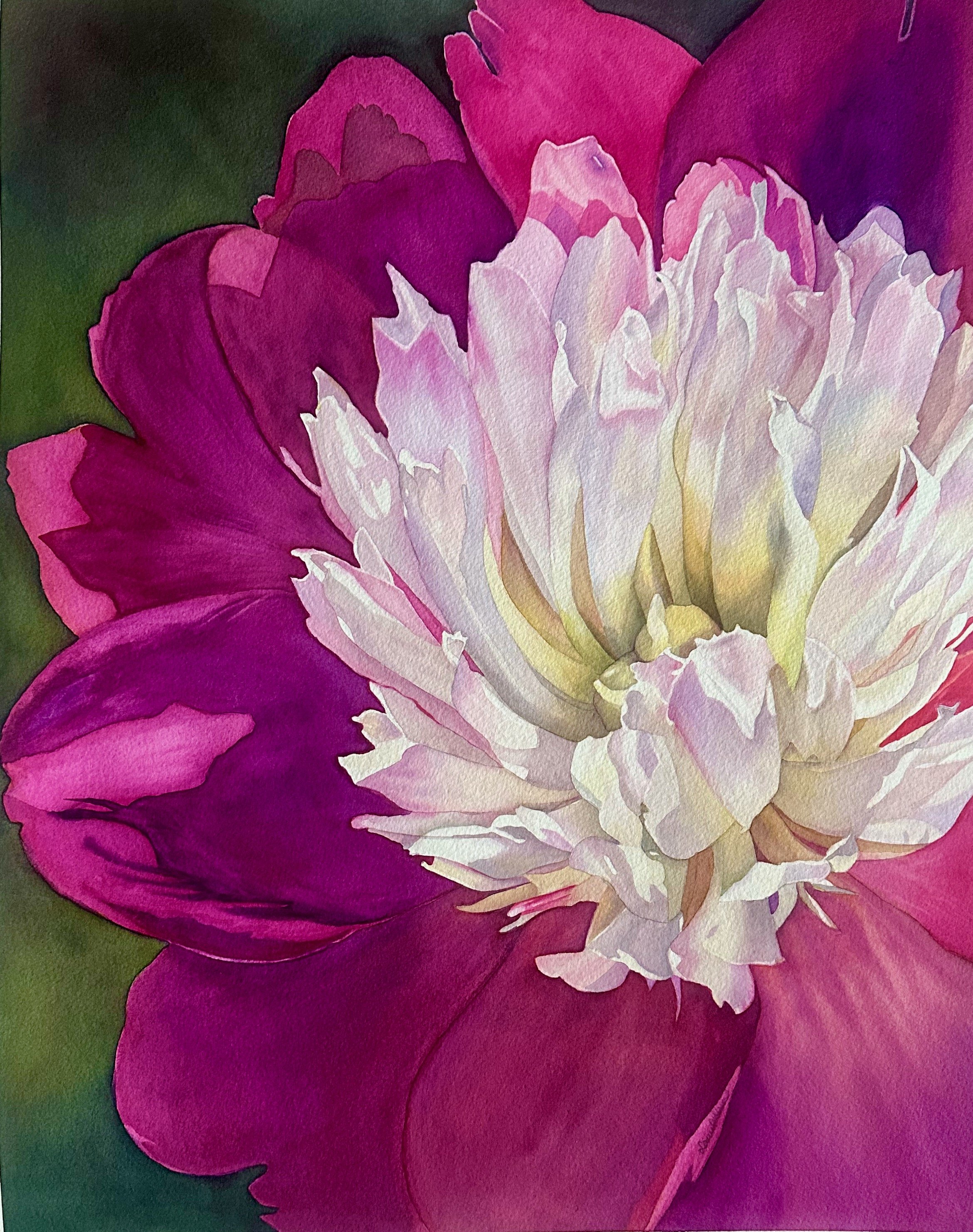
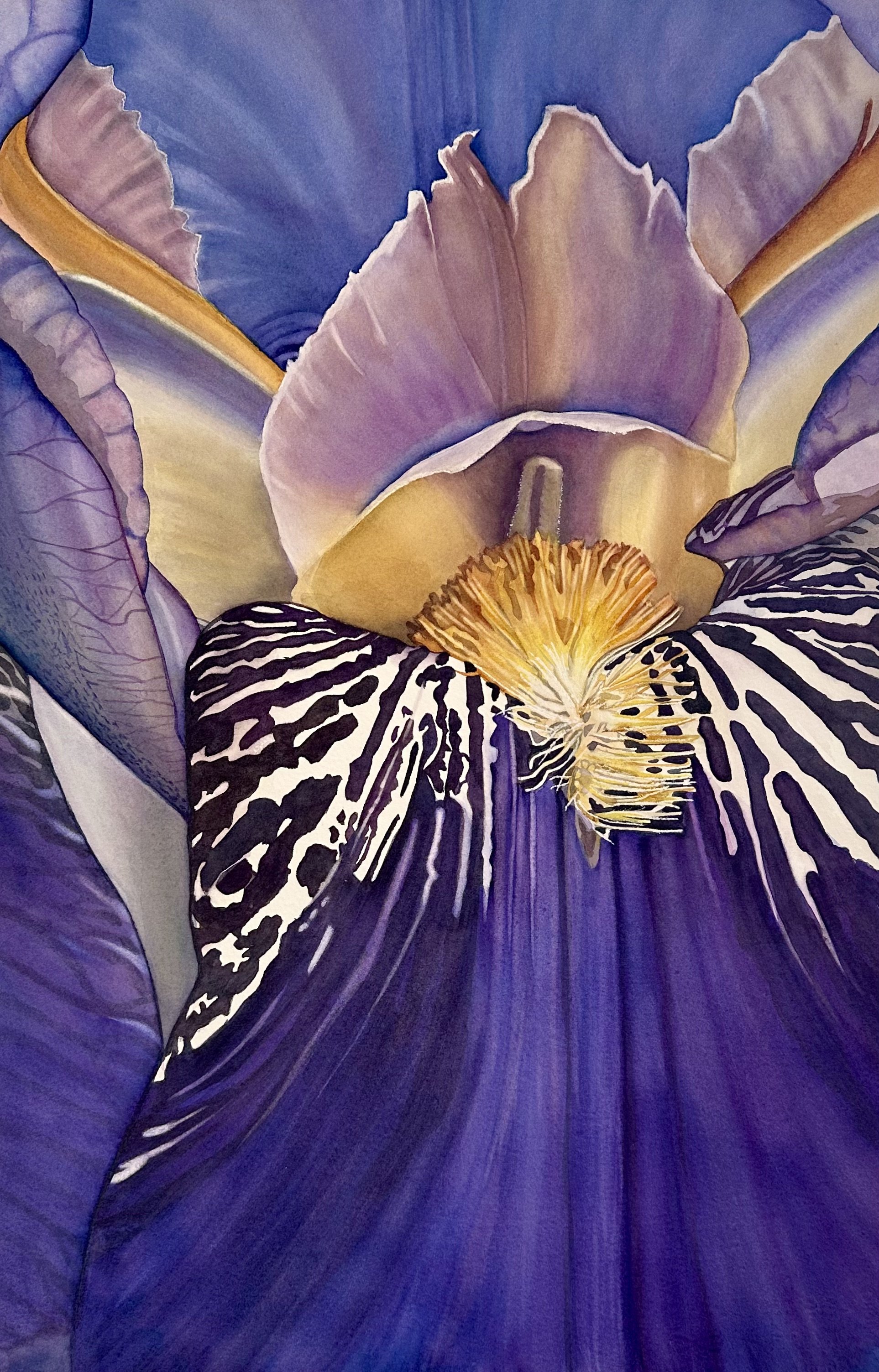
This 15 x 22” watercolor study focuses on the detailed structure of the iris, showing its layered curves and textures up close. The painting contrasts deep purples and bold black-and-white patterns with the soft yellow of the stamens. It’s the first piece in a three-part series exploring the relationship between warm and cool tones. Framed size: 18” x 24”.
Suggested places to hang it at home:
Above a console table in an entryway to create an immediate focal point
Over a sofa in the living room paired with neutral pillows to let the colors stand out
On a bedroom wall above a dresser or headboard for a calm, intimate touch
In a dining room to add a pop of color without overwhelming the space
In a home office to provide visual interest and a touch of inspiration